Business Feed Redesign
2025
Business Feed is QuickBooks' AI-powered insight engine. I led end to end redesign as the solo product designer, from research and data deep dives to a scalable framework adopted across QuickBooks.
Solo Product Designer
Role
QuickBooks mobile App on iOS & Android
Product area
Success metrics
150% Engagement jumped
Engage rate grew from 3% to 7.2%. Active users grew from 21K to 47K.
Design goal
Mobile-native, easier to take action
Deliver a mobile-first Business Feed that maximizes engagement by surfacing the most relevant, high-impact “done-for-you” tiles, feels native to mobile with a fast and intuitive on-the-go experience, and turns insights into instant action with fewer taps and less effort.
The approach
Mobile isn't a smaller screen, it's a different posture. I designed for the thumb, not the mouse.
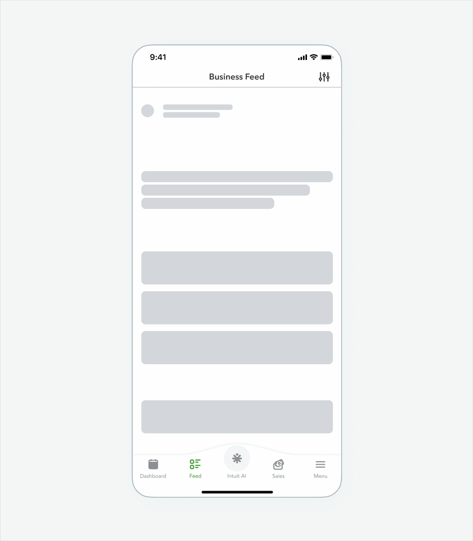
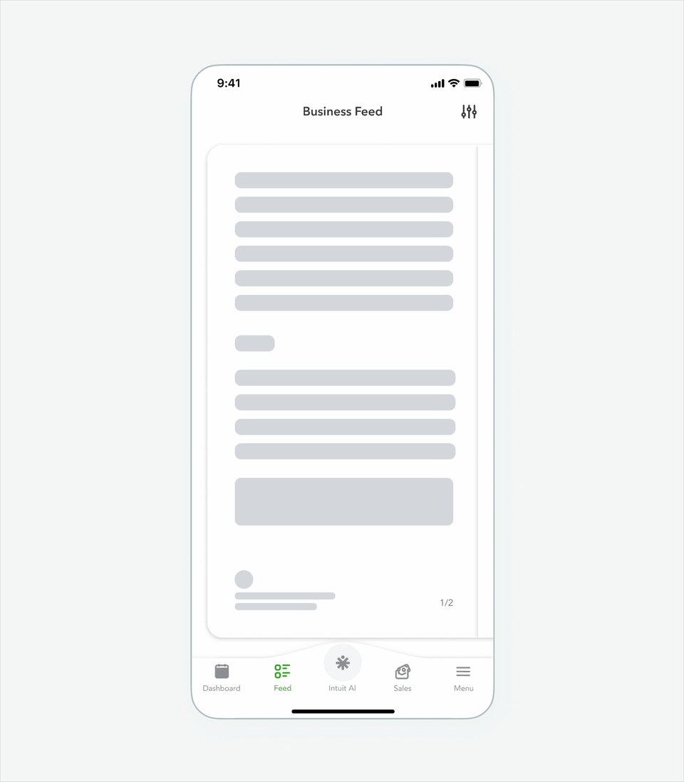
Current design
Direct port from web
A web-style feed on mobile shows everything, which means nothing gets attention.
Usage data showed users clicked into Business Feed but only 3% engaged, a signal that interest existed, but the experience was too overwhelming. So I came up with the principle:
One insight at a time, always with a clear CTA
Design exploration
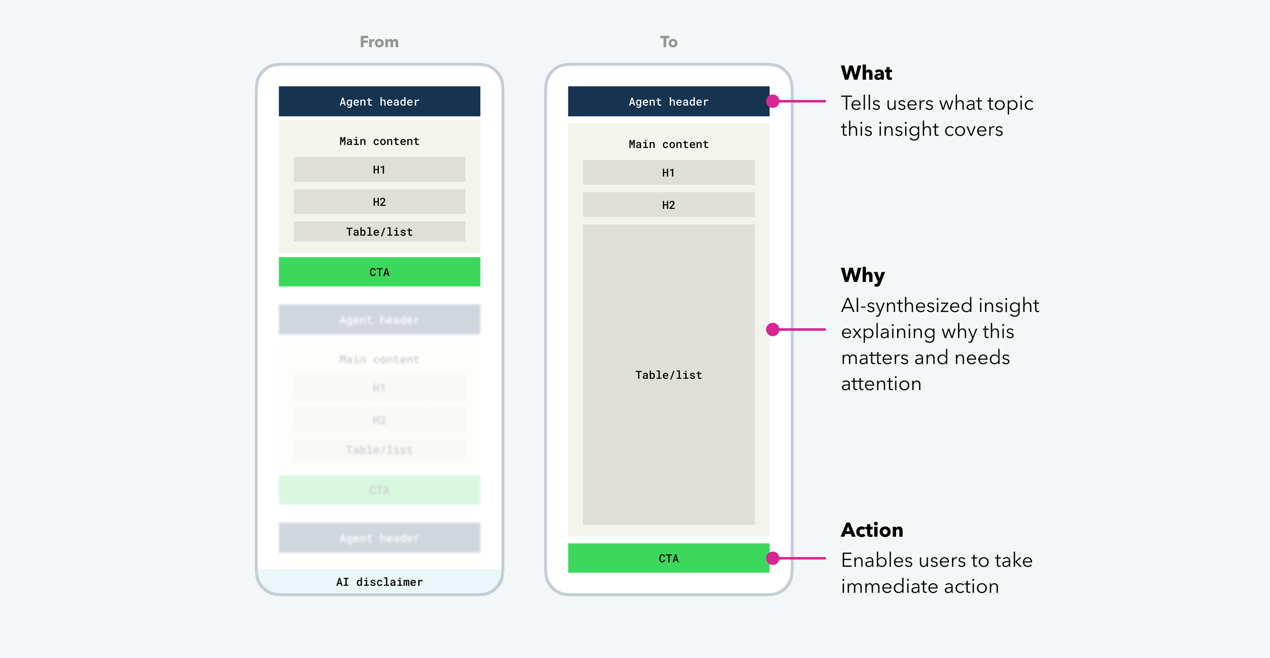
Applying the principle, with the goal of preserving everything the original Feed communicated, I designed a what → why → action framework that restructures each insight into a single, scannable card.
Turning the endless scroll of stacked content into one focused view.
Interaction exploration
With the framework in place, I began exploring interactions native to mobile.
Long scrolling feed
Swipe feed
Stack & slide
User testing result - Swipe feed won
Small business owners want to know exactly how many cards are left, because for them, time is money.
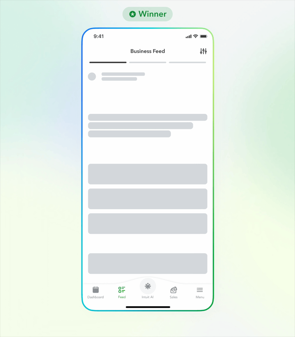
Solution
Story-style feed
A Business feed that showing insights that grouped by transaction type and shown one at a time, prioritized by importance.
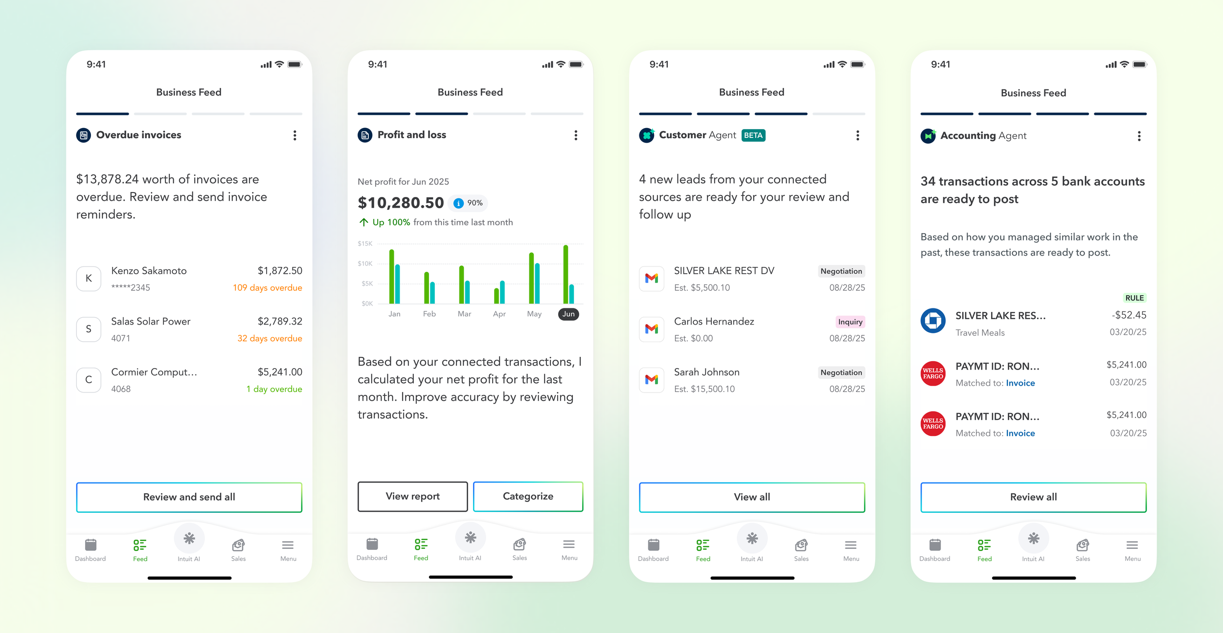
Design highlights
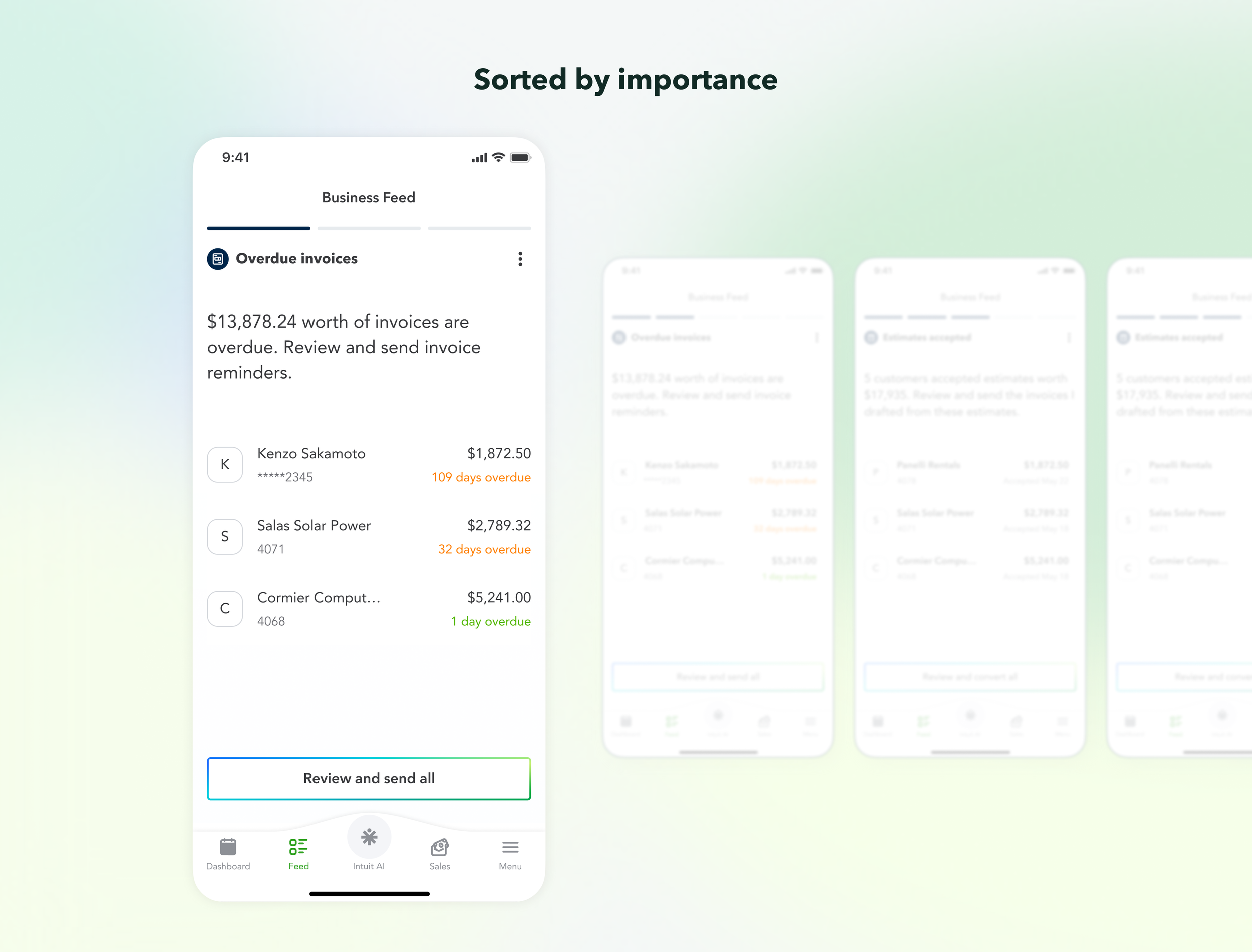
Insights sorted by personalized importance
AI personalizes and surfaces users’ most critical transactions first, so users never miss what matters, no matter how busy they get.
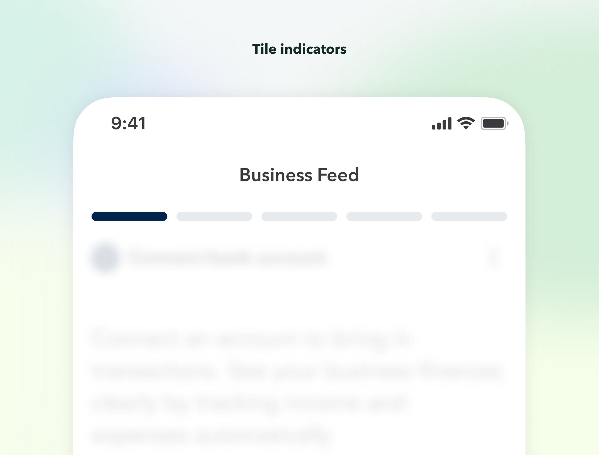
Tile indicators
Users always know how many cards are left — so they can mentally prepare how much time this will take.
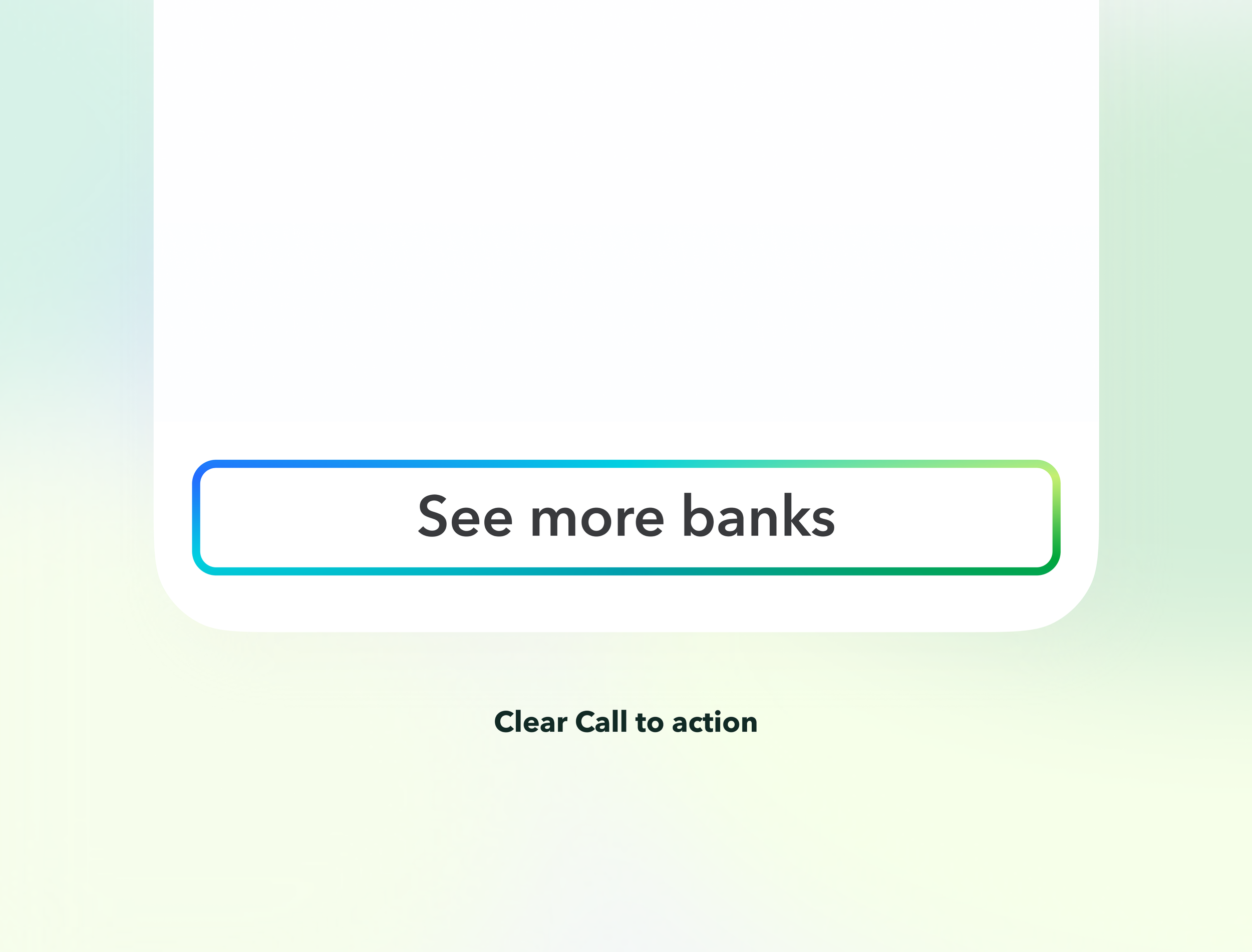
Clear Call to action
CTA sits in the thumb-reach zone , making it effortless to know exactly how and what to act on.
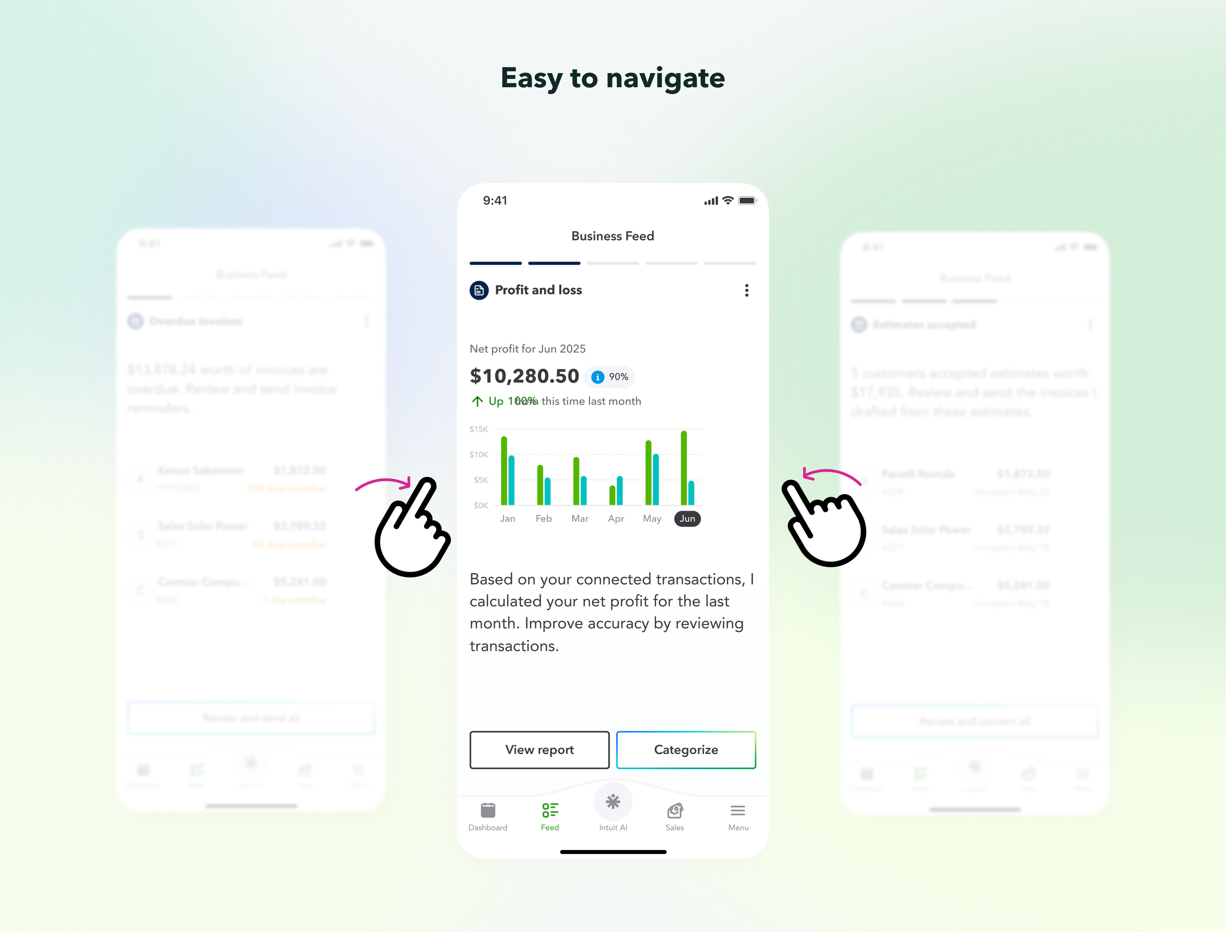
Easy to navigate
Swipe to navigate is one of the most natural and familiar interaction pattern on mobile.
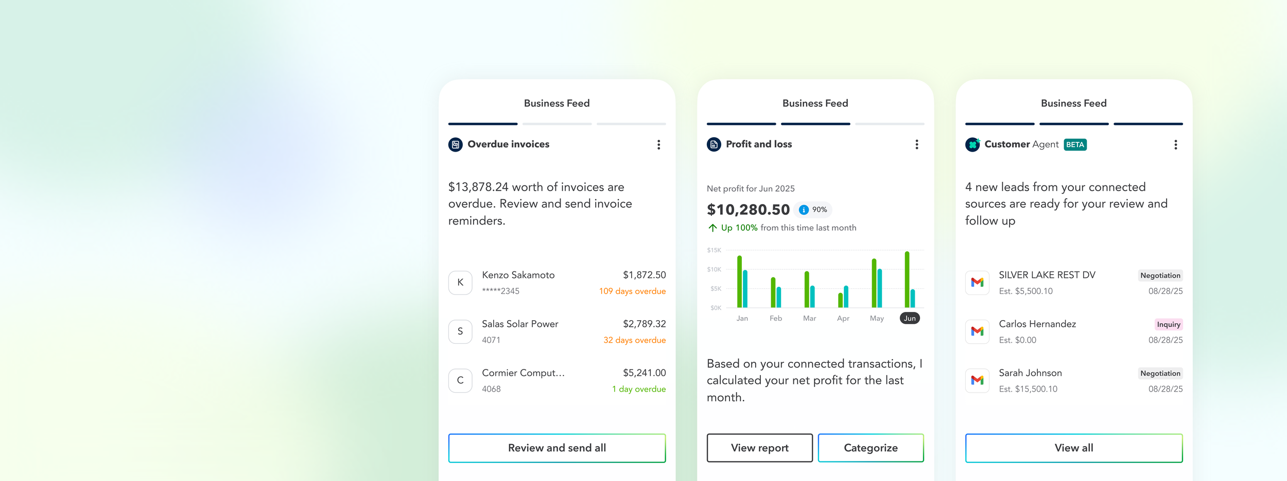
Internal impact
This framework is now adopted across external teams for Bank connection, Overdue invoices, Estimates, Reports, and Customer agent to form a holistic workflow within QuickBooks for small business owner.
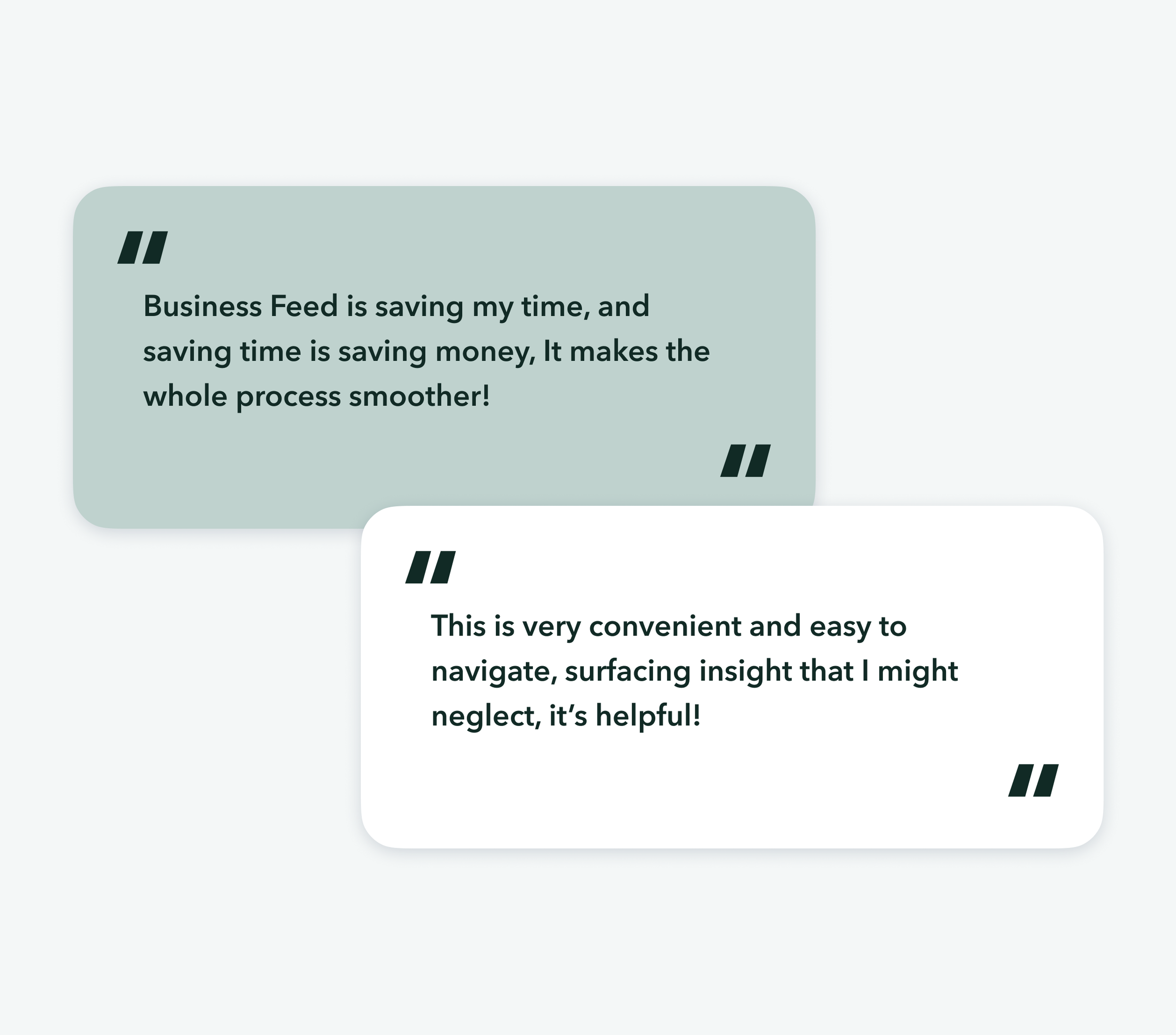
User feedback
The Business Feed received overwhelmingly positive feedback. Users found the swipe story easy to navigate and said it saved them significant time finding the insights that matter most, overdue invoices and uncategorized transactions were highlighted as the most useful.
This response reinforced my design decision: scannable, digestible, and easy to move through would help QuickBooks mobile users manage their business on the go, wherever they are.