Discoverability for an AI assistant
2025 - 2026
An unified onboarding and empty state experience to bring awareness of the AI assistant and educate user about what to ask.
Mobile Product Designer Lead
Role
Software Engineer, Product Manager, Content Designer, UX Researcher, Data Scientist
Team
QuickBooks mobile App on iOS & Android
Product area
Impact
Prompt engagement up 13.5% and climbing.
Context
The biggest challenge with AI in QuickBooks is user mindset.
When our uses come to Quickbooks, they know what they want to do, so they just get in, get their tasks done, and leave as quickly as possible.
Because time in the product is so limited, users often miss our new feature, Intuit Intelligence—it’s simply hard to discover.
Problem
91% of users who saw it never sent a prompt.
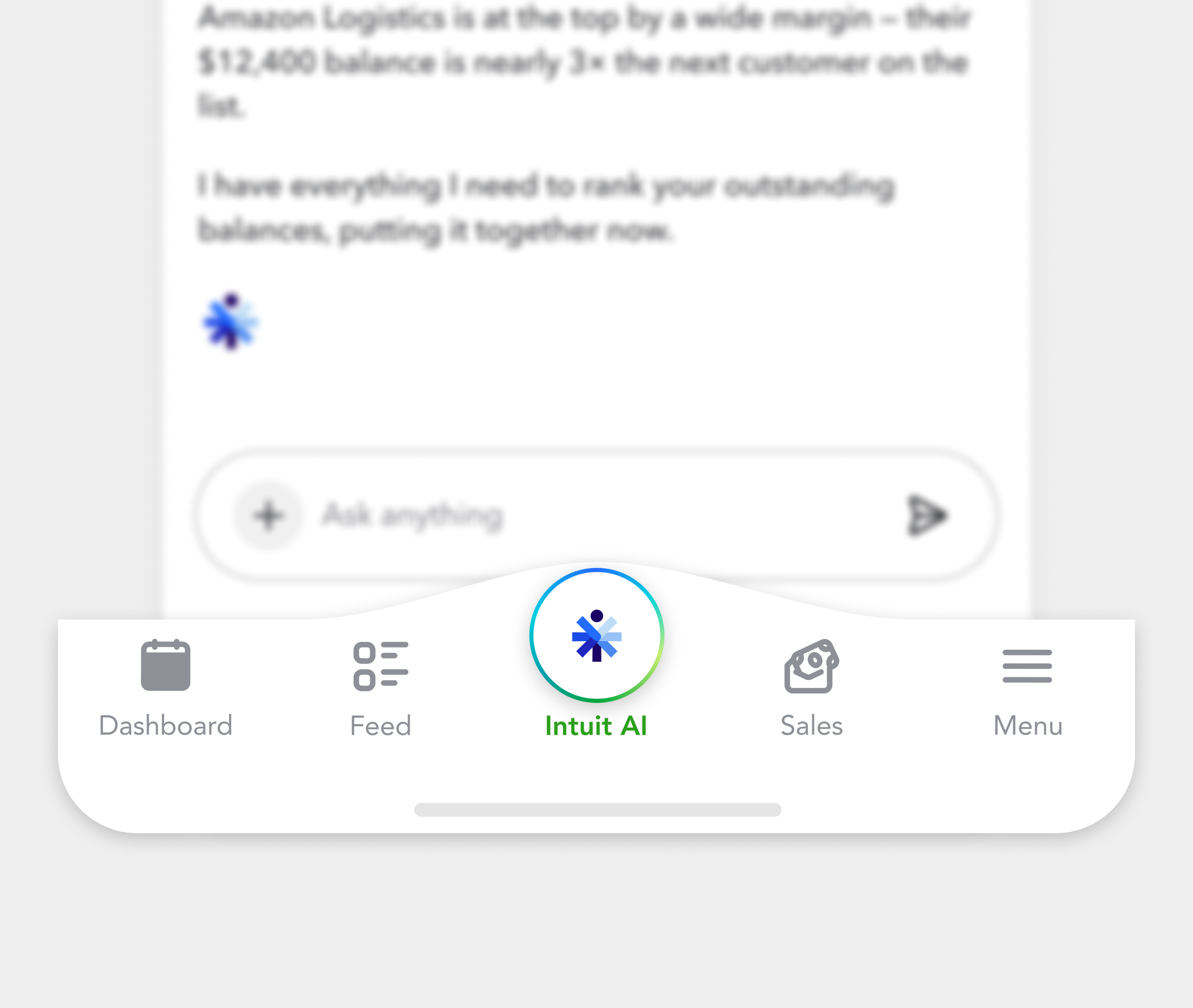
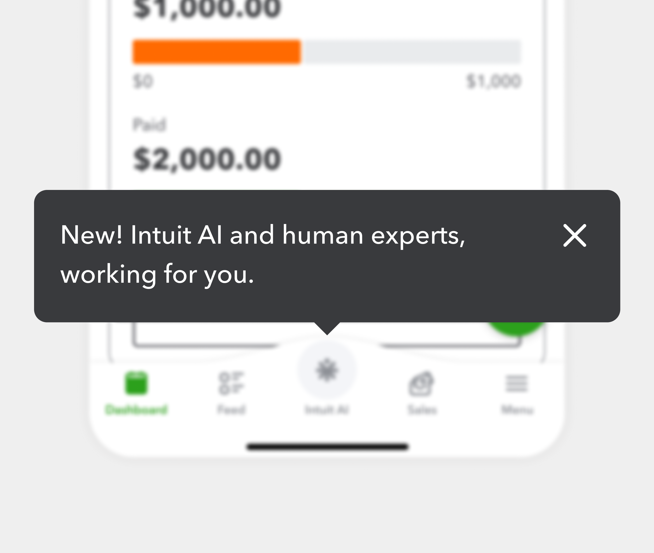
when Intuit Intelligence first launched on mobile, I designed a new bottom navigation and added a homepage tooltip to bring the awareness of this new AI assistant.
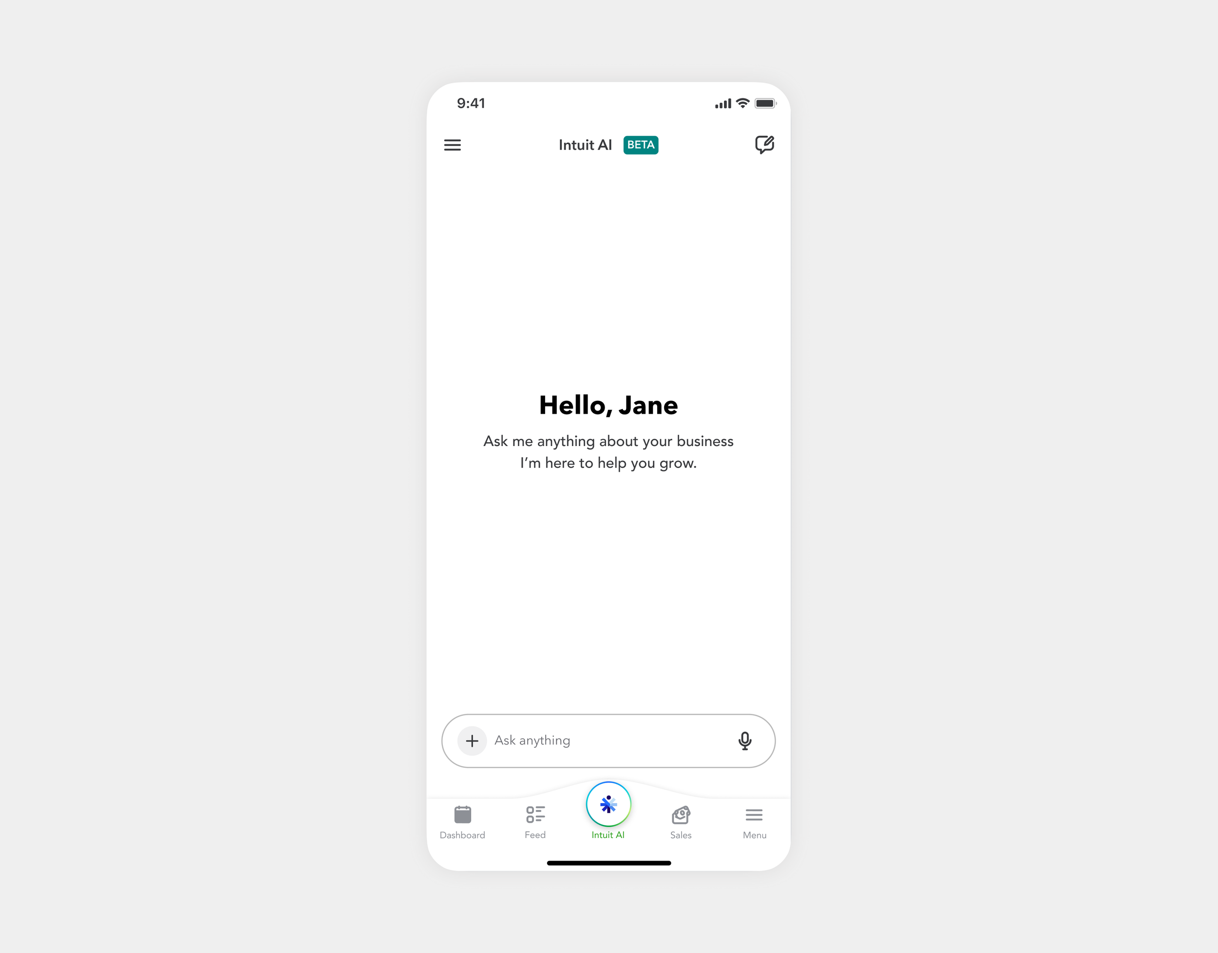
Users came, but 91% of them who saw it never sent a prompt. Dropped in with no guidance, most mistook the assistant for a help bot and left without learning what it could do.
New bottom navigation
Homepage tooltip
The blank box with no guidance
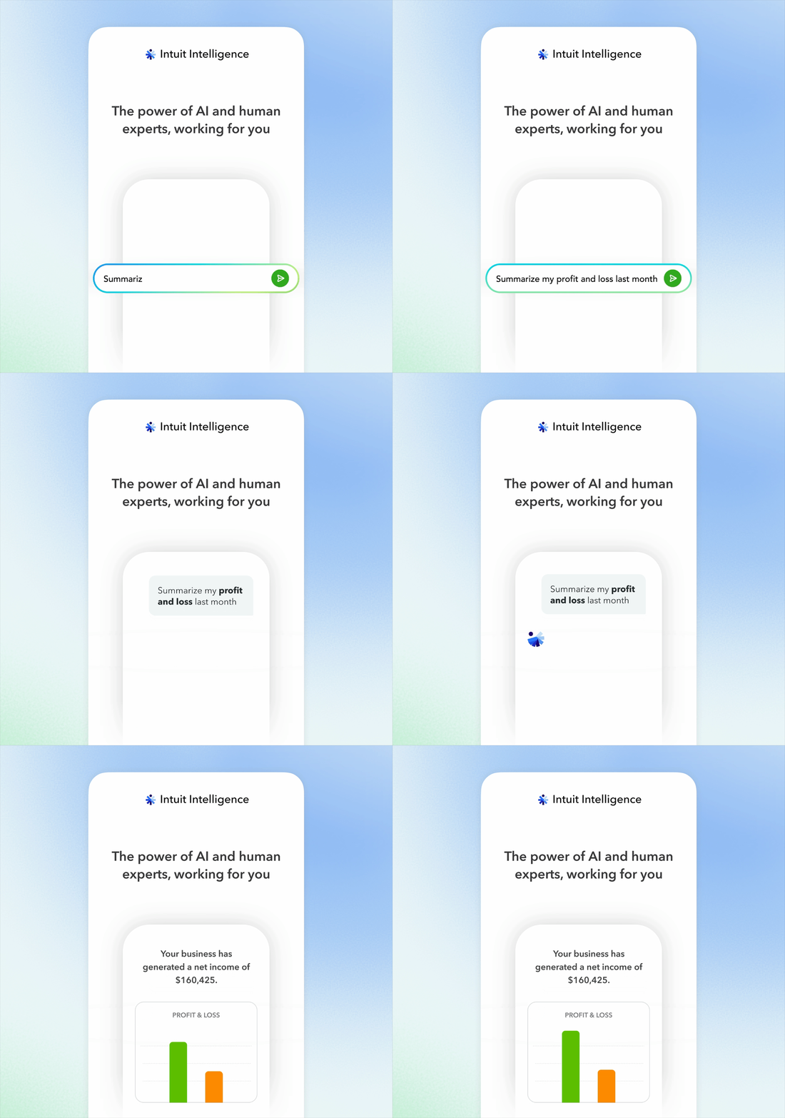
Process - Onboarding animation
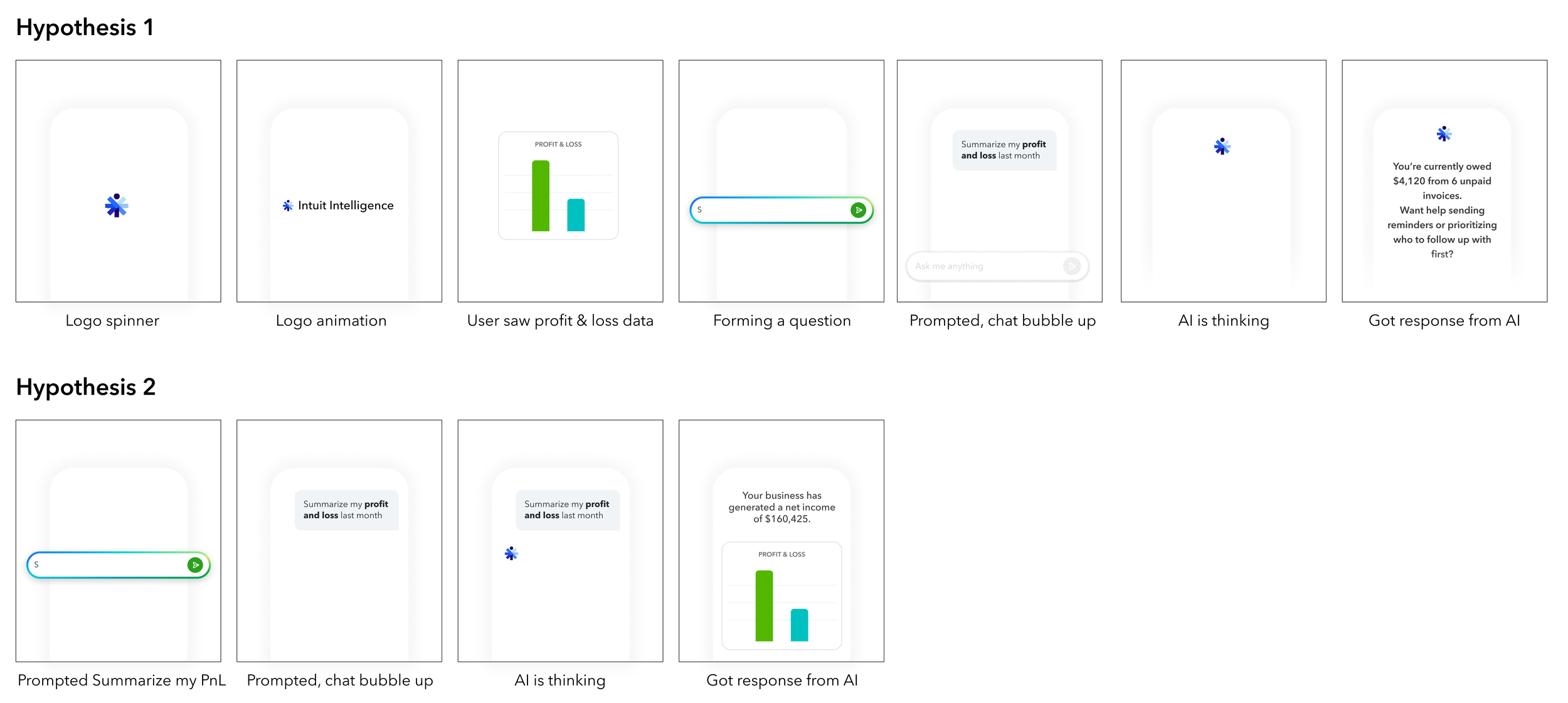
I chose to use animation to guide users through complex flows, avoiding heavy text. And started with 2 hypotheses and tested with users.
Hypothesis 2 eliminated the logo animation and jumped straight into the demo significantly shortened the overall motion, which aligned well with users' short attention spans and surprisingly increased their willingness to keep watching.
The solutions
1. A unified Onboarding + Empty state
Onboarding answers why. The empty state answers what. Each screen progressively builds understanding, so by the time users type their first prompt, they already know what this AI can do for them.
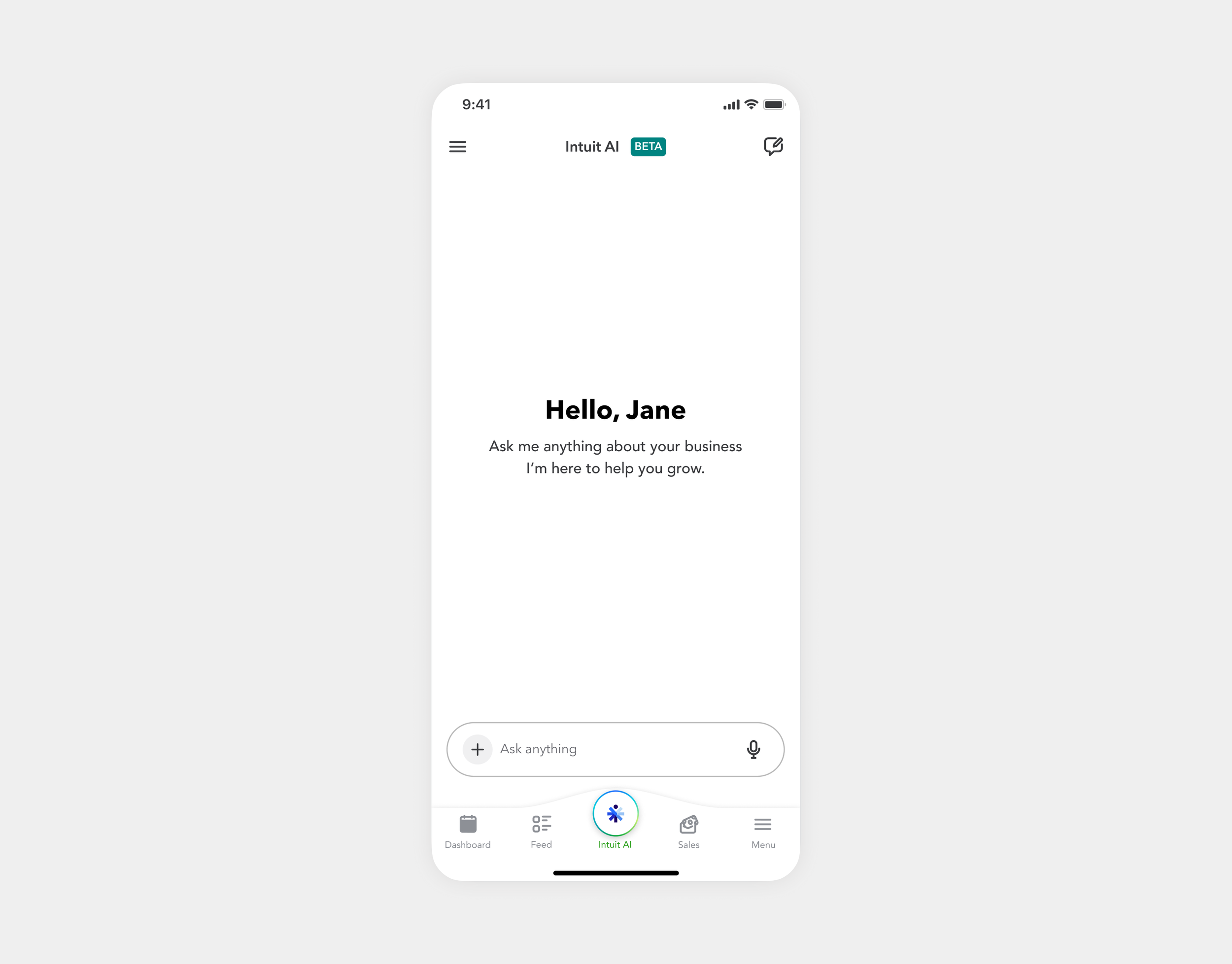
Before
91% of users who saw it never sent a prompt
Dropped in with no guidance, most users mistook the assistant for a help bot, and never found out what it could actually do.
After
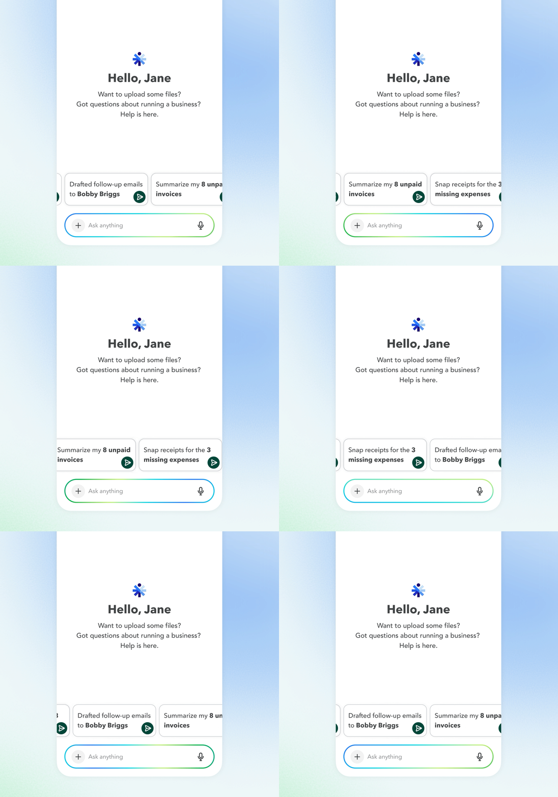
Setting realistic expectations
Animated onboarding demonstrates what the AI can do, turning users' first interaction into a hands-on tutorial for effective AI use.
Enabling quick starts
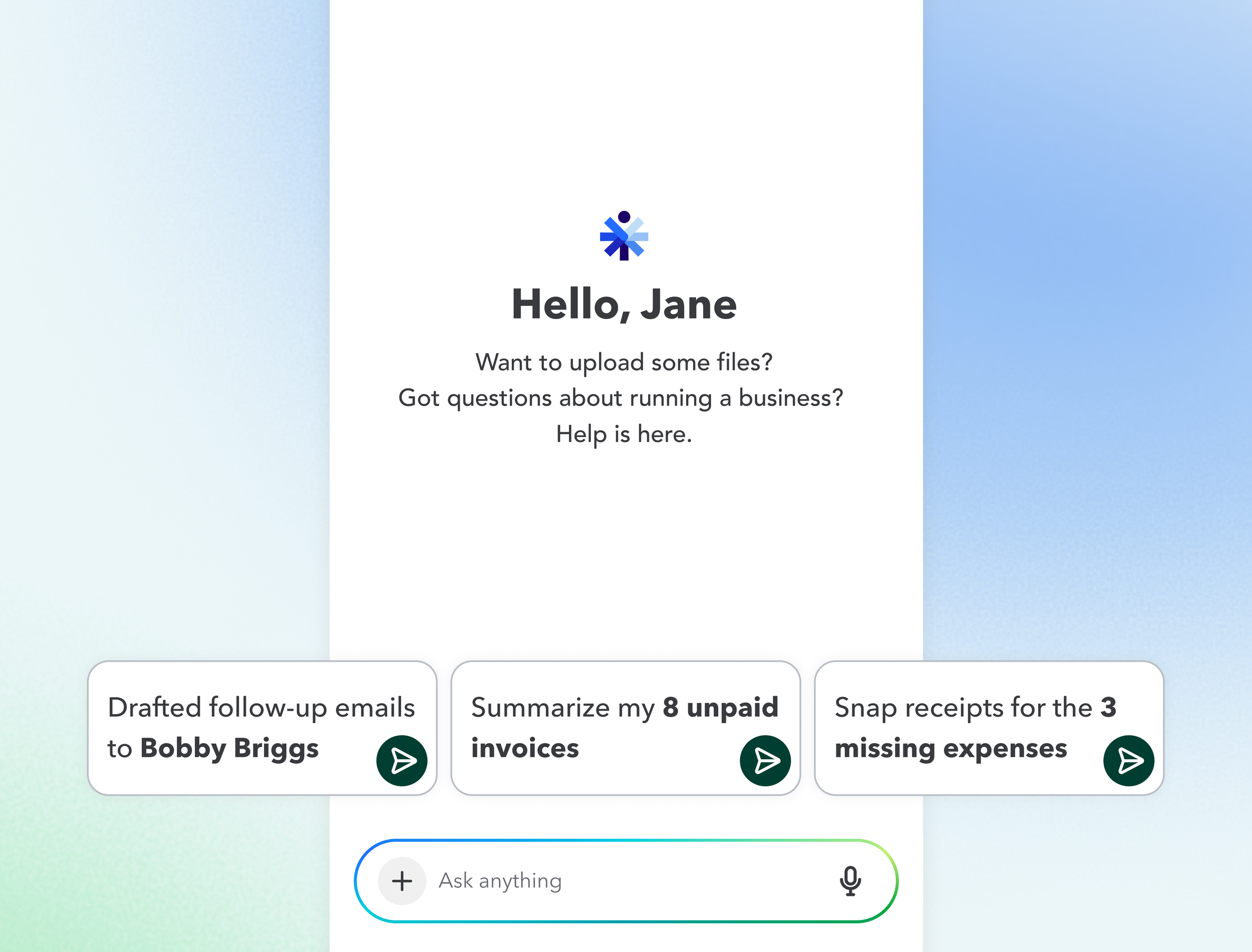
Insight paired with a suggested action creates personalized prompts, a starting point drawn from the user's own books, not a blank box.
2. Consolidated insight + prompt
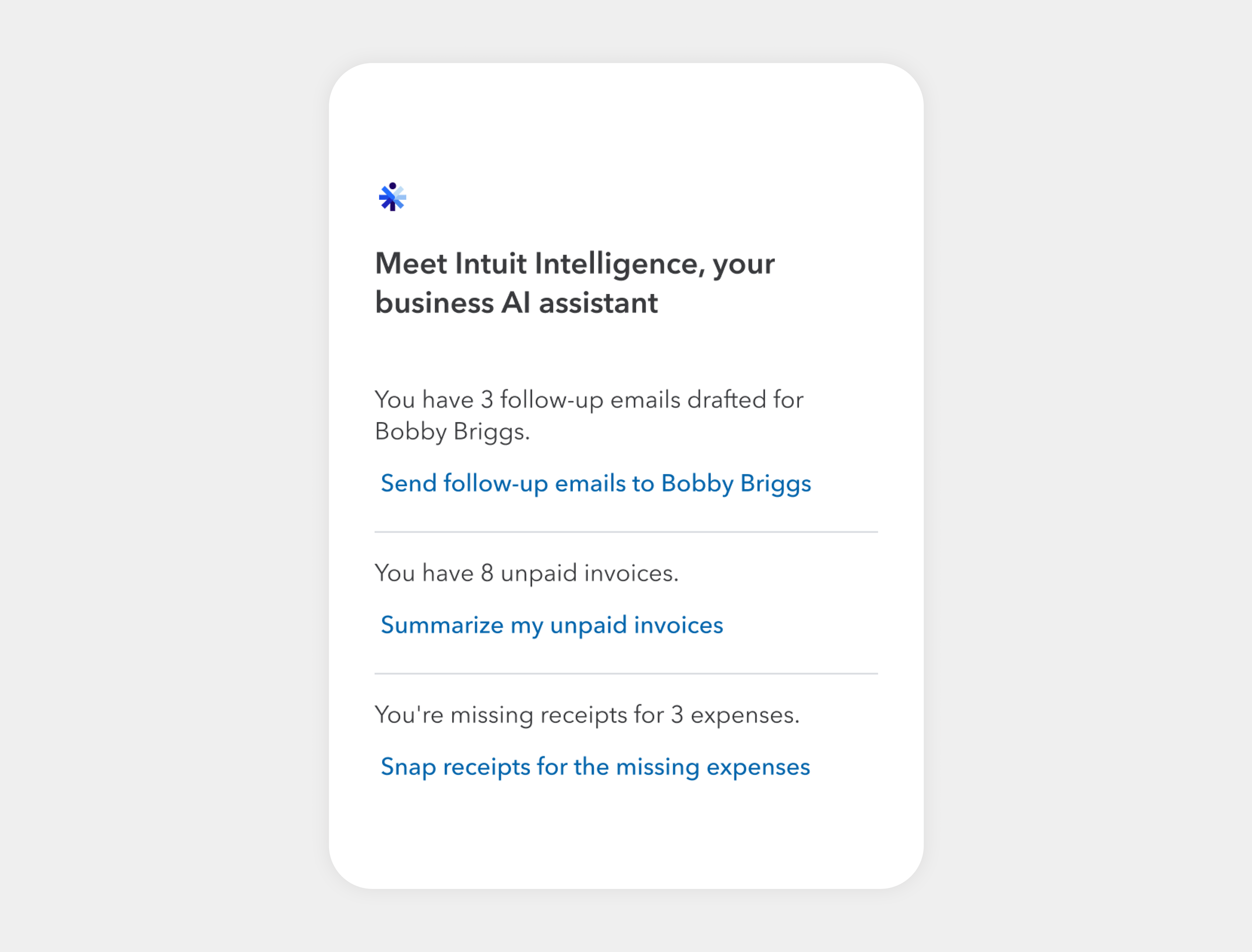
On web, insight and prompt were separate; a small screen has no room for that. I pushed our data analysts to merge them: "Summarize my 8 unpaid invoices." The reason to ask is embedded in the ask. Web later adopted the pattern.
Before
Original design separated insight and prompt, hard to read and take action.
After
Consolidated one line prompt tells both the insight and the prompt.
The impact
Prompt engagement up 13.5% and climbing.
The blank-box problem didn't disappear, it became a smaller front door with better signage.